
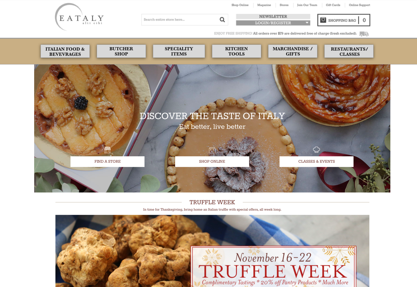
The redesign of eataly.com
UX Redesign Project
My Role: UX Researcher/Designer
Research Team: 3 people
Design Team: 1 person
Duration: 2 weeks
Project Status: Ongoing
Background
Eataly's flagship NYC Flatiron store is a shopping experience curated by famous chef Mario Batali. The idea behind Eataly’s physical store is to deliver upscale Italian foods and eateries all in one space. The layout is chaotic and evokes buzzing visions of food markets akin to Italy and Istanbul. While the chaotic layout and navigation of the store may be a welcome differentiator for the store, the word chaotic doesn’t translate well to a website.
The team and my role
This project began with a team of 3 UX Researchers and then evolved into my role which was an individual endeavor to synthesize the findings and propose a redesign of the web and mobile site. This article will focus on the research findings as well as depicting the proposed redesign of the desktop site done by me. The goal is to confirm whether a redesigned navigation provides a simpler and more efficient way for customers to complete their tasks online.
Discover & Define

Contextual Inquiries>>PERSONAS
A contextual inquiry is a interview with the goal of obtaining information about the context of use. Users were observed in their environment, in this case Eataly's physical store. Nine shoppers were approached in the Flatiron store. The individuals were asked for permission to be followed as they shopped and asked questions based on what they were looking for or doing. The findings from this research method helped shape two personas, the local and the tourist, Eataly’s main customer base.

Primary Persona
The tourist became the main focus persona for this project. Tourists are a plenty at Eataly's store and make up a large part of their customer base. Like Tara they are more likely to stop on the online store and therefore the design is based on their needs.

Secondary Persona
Upon speaking with locals the findings were that they hardly use the website, they pop in and out to pickup a few ingredients. The extent of how often they visit the store is minute.
Heuristics
In studying Eataly's website it's good practice to check on their competitors. The goal of this piece of research is to determine what competitor websites offer, how they are structured and what features do they all possess. It is also helpful in determining how Eataly can improve to be more competitive in the market.
Comparative Analysis


Comparative Features and Competitive Matrix results:
Eataly ranks well with high-end customer needs for perks like: classes, on-line recipes, and newsletters/magazines.
Eataly ranks poorly on basics such as navigation and product details.
A closer look was taken to their top competitor Citerella. In examining Citarella's site we were looking for good findability, navigation, the layout and scanability in cart pages, product pages and home screens. The takeaways were that while both Eataly and Citerella’s checkout process seemed cumbersome (many screens had to be navigated to process a checkout), Citeralla beats Eataly’s website in some important areas.
Citerella's site:
- Cleaner and simpler
- Had less promotion and clutter
- Easier to navigate | Fewer categories
- Categories led directly to product
- Product detail pages were cleaner and more descriptive
Usability Testing 1 = Navigation overhaul
The current Eataly desktop site and mobile site were tested with 4 users. The results from this initial test further proved that Eataly’s 10 global navigation categories needed to be distilled down.
User problems
ITEM SELECTION TASK: Buying Pasta Sauce — users had issues finding Pasta sauce. Most users looked under the “Sauces” category while it was actually found under “Tomatoes”!
SERVICE SELECTION TASK: Restaurant Menu Search— users searched up and down the site for a restaurant list. Eventually some completed the task as the list was found in the store sitemap or in the FAQ. While ultimately some success was had it was very cumbersome to find the list.
Card Sort
A 3 round card sort was performed on Optimalworkshop.com where 4 users arranged 101 cards containing Eataly's product items into categories. Round 1 was users placing products into Eataly's current categories to determine how logical their current system was. Round 2 was an open sort where users placed items into categories of their own making. Round 3 was users placing products in newly formed categories iterated from feedback in prior rounds.
The goal: Use the item groupings as a guide to come up with a lower number of logical global navigation categories for the redesign. With the findings from Round 1 and Round 2, new distilled categories were created to determine item placement that is logical and intuitive to users.
The takeaway: Newly iterated categories in Round 3 provided much less confusion among the participants. The Navigation menu in the redesign was therefore cut from 10 categories to 6. As sorting was timed it can be surmised that the new categories may lead to a shorter navigation time by as much as 1 minute (based on the timing of the final sort).
Design
Low-Fidelity Sketches
Sketches depicted here are changes to the main global navigation, new categories, more product information as well as more detail in the product pages and a simpler checkout process.

annotated Mid-Fidelity Screens (Desktop and Mobile)


TASK FLOWS OLD >> NEW
The redesign features a new navigation menu and a streamlined checkout that reduced the number of screens the users have to click through to complete their task.
User Testing of Redesign: Round 1
Desktop and Mobile Scenarios/Tasks:
Scenario 1: You are visiting New York this week and Eataly is the first stop on your agenda.
Task 1: Find Eataly’s restaurant list / menu
Task 2: Find classes and sign up.
Scenario 2: You’ve enjoyed your stay and loved Eataly’s flatiron store. Your bags are full but you wanted to buy some merchandise for your folks at home.
Task 3: Find a gift basket for under $100, buy it and checkout.
Task 4: Find pasta sauce, buy it and checkout.
Key Takeaways from Round 1:
•3 of 4 testers completed all tasks successfully.
•Only 1 tester missed a task (restaurant list).
-More info needed under the restaurant name in the listings.
-Restaurant result page was ambiguous; make it more clear it is a list of restaurants.
Reiteration


User Testing of Redesign: Round 2
The key takeaway from Round 2 testing was that the first redesign might be regionally biased. The task which caused issues for some users was searching for a restaurant list as well as classes offered in-store.
- 2 testers from New York found the restaurants list and classes list under the “IN-STORE” category.
- 2 testers from the Mid-West haven’t been to Eataly and were unaware there are restaurants in the store or that classes are even offered there.
Since “IN-STORE” confused the non-New York testers, and recalling that our primary persona is a tourist, there is a need to ensure that the category is less vague. To solve for this issue the category was changed to “Restaurants/Classes” in the final iteration.
Delivery - Prototype
Conclusion
Eataly online turned out to be a great choice for a redesign project. The initial tests of the current website proved that the site had major navigation challenges.
The research performed was very insightful and really helped develop the final iteration of the redesign proposal.
Contextual inquiries >> Customer base, locals and tourists.
Card sort >> New categories.
Heuristics >> Simpler and cleaner site.
User testing >> Regional bias and category change.
NEXT STEPS:
- Test the new "Restaurants/Classes" category
- Further develop the prototype into hi-fidelity.